 |
| Where the potential is. |
 |
| Where the potential is being tapped. |
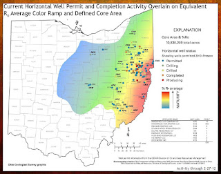
I think these two slides tell the story pretty well why some in Ohio are seeing a boom and some are not. Often, nearby counties are seeing the economic impact of the shale play completely different from each other.
In Licking County, we were seeing new leases signed and lots of discussion stirred up, but, to use an analogy, it's as if the industry has taken its foot off the gas pedal. There seems to be a coasting. The maps from ODNR mirror that sense. Licking County is in the blue area on the map which is interpreted to mean it has potential, but it's not seeing as much activity.
Meanwhile, in places like Jefferson County (along the Ohio River), the discussion is much more robust and the industry is very much keeping its foot on the gas pedal and, occasionally, accelerating. The red area of the map is the most mature potential and, uncoincidentally, is also where the activity is concentrated too.
Keeping the analogy though. It's worth noting that when one takes one's foot of the gas pedal, it doesn't mean one isn't still moving forward. No one said anything about putting the foot on the proverbial brake.
Thanks for the analogy, Brad.
No comments:
Post a Comment